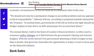
 Jon Bernstein writes for The Guardian about how some media outlets are using technology to keep readers longer.
Bernstein writes, “When the Bloomberg Business site relaunched at the beginning of the year, one of the least noted features of a visually arresting redesign was a thin, horizontal blue bar that fills up as the reader works through an article. Many web users already instinctively track the vertical scroll bar on their browser as an indicative guide of progress. Bloomberg’s approach clearly borrows from this but whereas the vertical scroll indicates where you are in relation to the end of the page – a page that is likely to include related links, adverts, promos, a boilerplate and all – the horizontal time bar tells you where you are in relation to the end of the article.

Read more here.


